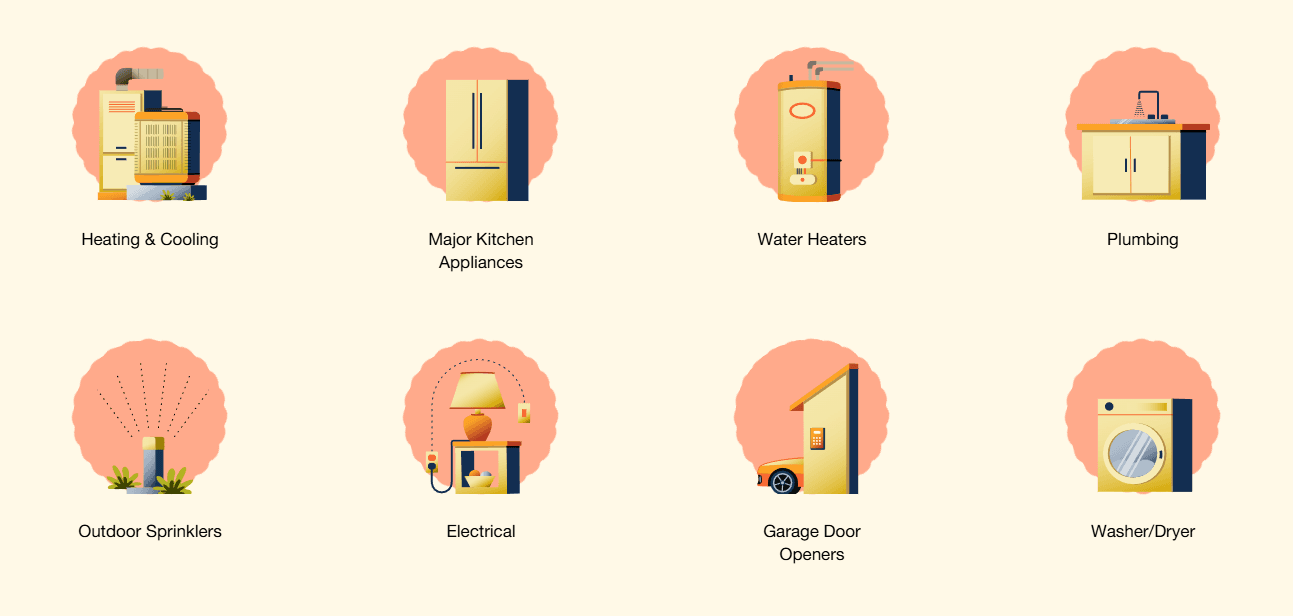
Stymix is a hub of designers, developers, and marketers with the right expertise to help turn your ideas into richer digital products and content experiences
Close
Get in touch
hello@stymix.comFollow us
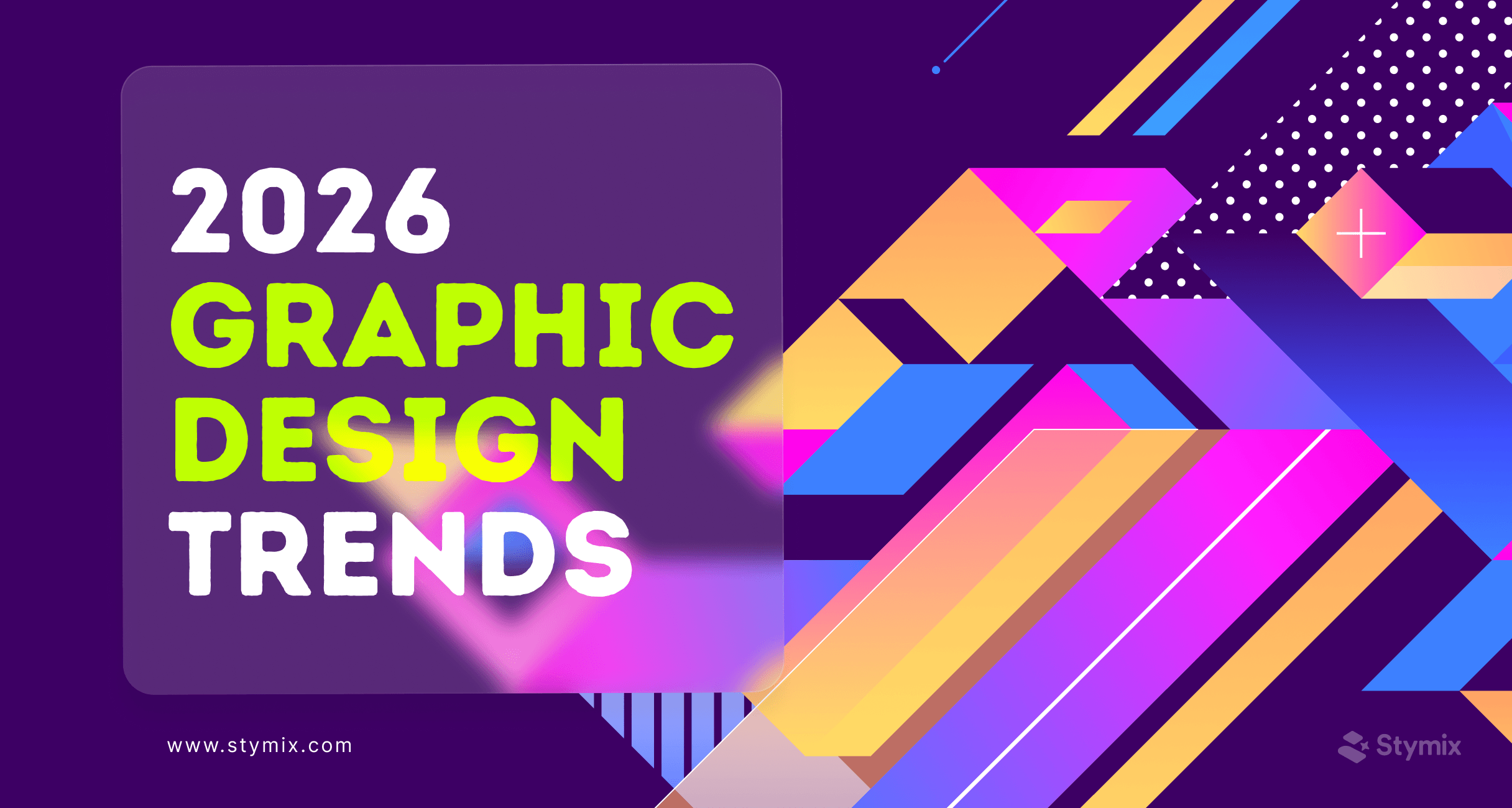
Top graphic design trends of 2026 - will they be similar to the ones from 2025? No! Graphic design trends are constantly evolving.
New tools arrive.
Old styles return.
People always expect something new, more emotion, and more meaning. And as graphic designers, we enjoy spotting these shifts before everyone else notices them.
Here’s the interesting part. In 2026, design won’t only be about how things look. Style will still matter, of course. But the real focus will more likely be on how a design acts and what kind of voice it carries. So let’s walk through the top 15 graphic design trends you'll probably see everywhere in 2026.
Here’s a list of some graphic design trends that are going to be popular in 2026.
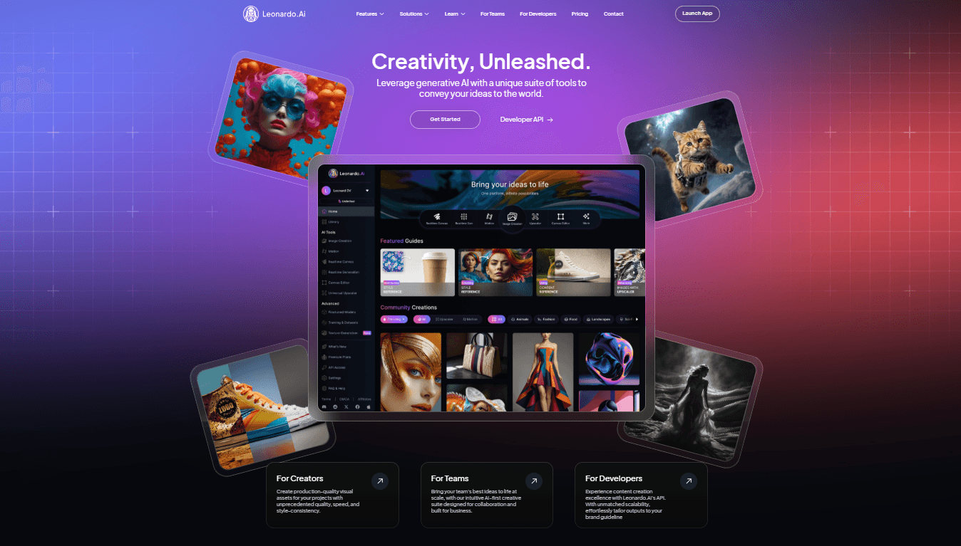
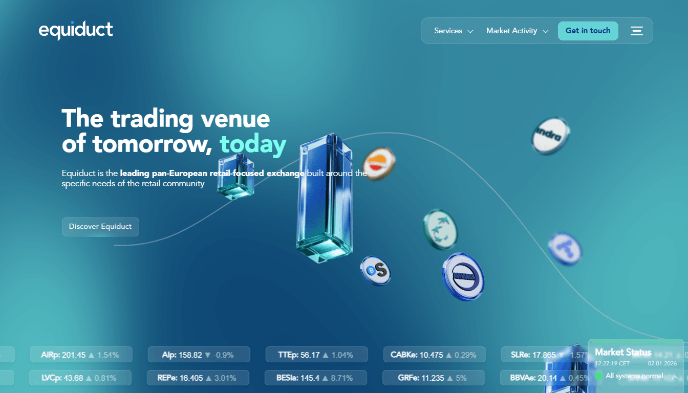
We’ve seen Bento Grids everywhere lately, and they’re not slowing down in 2026. This style uses clean blocks, rounded corners, and soft shadows to guide the eye smoothly.
With this layout style, your content is divided into distinct blocks just how a bento box splits food into compartments. It’s inspired by bento lunch boxes from Japan. You've probably noticed Apple using this modern design across product pages and app previews.
Designers love it for its simplicity. It's also organized and visually calm.
Many designers match it with soft color palettes for balance. Bento layouts often mix gradients, 3D icons, and minimal text. It’s perfect for brands that want structure with personality.
Distorted Reality Visuals are all about bending the rules on purpose. It could be warped letters, stretched portraits, twisted shapes, and frames that look like they’re melting.
The goal isn’t chaos. The goal is tension (or attention?). A little bit of “wait… what am I looking at?” goes a long way.
This style is actually not brand new. Designers in the 90s started bending letters and twisting shapes to make something emotional and rebellious. David Carson made misaligned type feel alive, full of attitude. Distortion soon appeared in music posters, rave flyers, and experimental magazines.
Now it’s back, but with a smoother digital twist. Modern tools make it easier to stretch portraits cleanly, bend type precisely, and build illusion-like shadows.
Creating this look usually involves warped grids, liquified portraits, sliced type layers, and subtle noise. The magic happens when everything feels intentionally “off,” not messy.
Some of the best niches this design might work great in are
Naive Design is one of our favorite trends at Stymix because it feels warm and honest. Everything looks a little imperfect on purpose. You’ll notice wobbly shapes, simple characters, loose outlines, and colors that feel like they were picked straight from a kid’s art table.
This style has deep roots in folk art, early picture books, and handmade posters. When the world got too polished, designers turned back to naive drawings to bring charm and humanity to design.
The pandemic years made this shift even stronger. Everyone wanted comfort. Everyone wanted softness. Brands like Mailchimp and Airbnb introduced playful, welcoming illustration systems that fit this mood perfectly. Many also paired them with earthy color palettes that radiated friendliness.
The visual recipe usually includes bumpy lines, simple shapes, uneven proportions, and lots of white space to make your eyes comfortable. The appeal lies in letting the flaws stay visible.
Gradients are not new. They’ve lived through several eras. They were basically everywhere in the early 2000s. Then Instagram revived them in 2016 with that unforgettable sunset gradient. Since then, gradients have matured into full design systems.
In 2026, gradients will do more than coloring the background. They'll act like lightning, create mood, depth, glow, and even atmosphere.
Designers use layered blends, soft clouds, neon flares, blurred edges, glassy sheens, and metallic fades. Each variation brings a different vibe.
These designs have so many sub-styles. You'll see holographic gradients, cyberpunk gradients, soft blurs, smoky gradients, AI-generated gradient clouds, and many more. And each one offers fresh creative opportunities.
Gradients appear everywhere now, especially in fintech branding, fashion visuals, UI hero sections, and album art. They bring curiosity and provoke interest without needing heavy detail.
Most versions focus on smooth color transitions, airy spacing, and light texture while everything blends into everything else.
Modern Blueprint Graphics look like someone turned an engineer’s secret notebook into a design style.
You’ll see thin outlines, neat measurements, wireframe shapes, and grid-based layouts. Everything feels precise, tidy, and slightly nerdy—in the best possible way.
This style has been around for decades because blueprints were originally used for buildings, machines, and product plans. Designers later borrowed the look for tech presentations and futuristic movie screens.
Apple, for instance, even used blueprint-style sketches when unveiling early interface ideas. It always signals “we’ve thought this through,” which people like and tends to trust.
The 2026 version feels cleaner and more digital. Designers use vector lines, glowing grid overlays, and simple icons that look like UI elements. The key design elements are still thin outlines, evenly spaced grids, labelled arrows, and one or two main colours.
This trend might work well when you want structure without heaviness. Some use cases are:
Minimalism is still in the list. Now it has become warm minimalism.
Warm Minimalism feels like minimalism finally got a human side. It still loves clean layouts and tidy spacing. But now it adds soft colours, warm tones, rounded shapes, and gentle shadows.
Classic minimalism became huge thanks to designers like Jony Ive at Apple. But sometimes it felt a bit cold. In the last few years, brands wanted to soften that vibe, especially in wellness and beauty spaces. So designers began adding texture, cream tones, subtle gradients, and warm lighting effects. It made minimalism easier to connect with.
The 2026 version pushes that even further. It feels modern, but also humane. Clean, but never cold.
You’ll see balanced spacing, a soft palette, low-contrast typography, and organic shapes. It’s a great way to create calm digital experiences without losing that professional edge.
Customized typography in 2026 moves far beyond simply choosing a “nice font.”
It’s about crafting letterforms with personality, almost like giving your text a wardrobe tailored by a very stylish designer.
In the past, designers relied on static fonts. You picked one and said, “Well, hope this works everywhere.” Now, typography becomes fluid, expressive, and adjustable in real-time.
Variable fonts and kinetic type rise not because they’re trendy—but because they solve real design problems: responsiveness, uniqueness, and brand identity.
The interesting twist? Designers now tweak type the way chefs season food. Just enough spice to make the experience memorable, without burning the user.
Interactive digital layouts bring motion, storytelling, and interface behavior together in one experience. Instead of static pages, users now explore living layouts that guide them visually and emotionally.
Early websites didn’t do much beyond ‘click here and scroll.’ But in the last few years, scrollytelling and micro-interactions have become common parts of modern web design trends.
This trend is about making layouts actively respond to users. Sections expand as you scroll, elements animate to tell a story, and content adapts to how you interact with it. It turns a simple page into an experience that feels alive, guiding attention naturally.
Neo Naturalism blends nature’s calmness with digital clarity. It’s not rustic nor messy. It's like nature with a computational skincare routine.
Designers mix organic shapes and earthy tones with clean, modern precision—a polished upgrade from early eco designs. Popular in early 2010s “eco design,” often felt like straight off recycled cardboard. On the contrary Neo Naturalism is more polished and effortlessly natural.
This 2026 version is balanced, elevated, and emotionally soothing. It reflects the global move toward wellness aesthetics and reduced visual noise.
Some brands, like Aesop, Everlane, and eco-forward tech companies, helped popularize this visual calm by adopting nature-inspired palettes long before it trended.
Data visualization isn’t just for late-night analysts with cold brew anymore. In 2026, it’s a full-on design language, showing up in branding, storytelling, and editorial layouts.
Historically, charts were functional tools, useful, yes, but about as attractive as spreadsheet leftovers. Then came the rise of data storytelling platforms and refined UX guidelines.
Today, designers use data not only to explain information but also to create editorial rhythm and visual identity.
It’s the closest design has come to making spreadsheets actually look cool!
Cute illustrations are still winning in 2026. Tiny characters, round shapes, and soft colors make everything feel warm and friendly—some even look like they’d apologize for existing.
Born from Japanese kawaii culture, icons like Hello Kitty showed how simple shapes can charm the world. Over time, brands used cuteness to make tech products, finance apps, and even healthcare platforms feel more human.
Why does this trend work? People don’t just want info. They want a smile, comfort, and a little reassurance.
Yes, Retro-futurism drifts back into 2026. But forget the faded version we’ve seen before. Now the lines are sharper, the glow is richer, and the vibe feels newly inspired. It’s that little intersection where yesterday’s idea of “the future” taps into today’s design precision.
Picture the vibe: vintage sci-fi posters, neon-soaked arcades, those early NASA sketches with impossible optimism, and the unapologetic chrome lettering from the 80s. Think Blade Runner’s mood, Cyberpunk 2077’s glow — but cleaned up and slightly less moody.
Today’s take is more polished. Designers play with shiny metallic gradients, gentle glows, tidy geometric forms, and retro tech elements that feel almost familiar, like a memory you never actually had.
And it works for one simple reason: this version of the future isn’t bleak. It’s fun. It’s glossy.
AI generated art styles have taken over the world already. And AI-assisted motion graphics will continue to be a major player in creative works in the coming years as well. You may worry about job loss, but AI does not replace skill. It clears dull tasks with speed. This shift helps you focus on clear ideas and key scenes.
Animators once spent long hours on keyframes, curves, and effects. AI tools now predict motion paths and set smooth shifts. These tools also create quick versions and adjust scenes for many screens. Each step saves time and keeps the work steady.
Designers still guide the story and the emotion. AI acts as a fast helper who works without pause. This helps cut long render waits and supports each stage of your plan.
Major tools now push this change with real impact. After Effects offers strong AI features. Runway and Wonder Dynamics add more support. Each tool makes motion work easier for more people.
3D and immersive graphics now give the screen a real sense of depth. Add shape and soft shadow to buttons, icons, and images and make it seem closer to the user.
3D has been a long-term trend, but in 2026, it moves beyond games and loud ads. It also gives you a new way to present clear ideas.
Modern browsers and devices now load 3D fast. You can use it without fear of slow pages. This helps you emphasize on key parts of a page and improve how users move through your work.
Old 3D often felt too loud or too heavy. The new wave aims for a real and quiet touch. You can add a small lift to a product photo. You can also place a mock-up that feels like a real item. These light moves help you show value with ease.
Fragmented-glass visuals now give your design a clear sense of break and depth. The shapes bend light in sharp ways. You see small shifts in color and form. Each shift pulls the eye forward. This feel gives the design a quiet sense of surprise.
This style does not rely on random breaks. Designers use clear layers of shards, prism flares, and soft glitches. Each layer adds depth and slight motion. These steps build a direct “wow” effect and the holds the user’s focus.
You may know this style from digital art and sci-fi posters back in the day. Now it appears in music videos, NFT art, and tech campaigns.
Glassmorphism has been in trend for quite some time now. It introduces a semi transparent layer to create break from the background. At times, the sole purpose of using it is to improve readability of text over a busy background.
Each use aims to break a flat look. This push makes it stand out in a clean design world. It also gives you a fresh way to show bold ideas. It feels firm, a bit free, and close to a future mood. It never feels loud. It shapes clear character in your design work. Each move helps you add strength without noise.
2026 is going to be a fun year for graphic design. Trends aren’t just about looking good anymore. Trends range from soft, cute illustrations to bold, fragmented-glass visuals. Designers are mixing tech, interactivity, and a human touch in fun new ways.
Try experimenting with these trends. Mix styles, play with layouts, and add your own twist. Let your designs surprise, delight, and tell a story; even a little magic counts.